

There are 3,997 different Android devices. Your navigation should work with all of them. C-Swipe can help: It is an alternative navigation pattern for tablets and mobile devices that is novel, ergonomic and localized. This article provides a detailed walk-through of the design and code and provides a downloadable mini-app so that you can try out C-Swipe to see whether it’s right for your app.
Let Them Pee: Avoiding the Sign-Up/Sign-In Mobile Antipattern
Anything that slows down customers or gets in their way after they download your app is a bad thing. That includes sign-up/sign-in forms that show up even before potential customers can figure out if the app is actually worth using.
The Definitive Guide To The Android Carousel Design Pattern
We’ll use the analogy of a real-world amusement park carousel to explain what makes for an authentically mobile user experience, and we’ll give you the design, the complete source code and a downloadable mini-app, which you can use today to add an enjoyable and effective carousel to your own app on phones and tablets.

Three essentials of Android design DNA
For many years since its release, the Android OS has been behaving like a teenager in the grip of raging hormones. Growth has been nothing short of explosive and the changes have been sweeping and profound. With the release of Ice-Cream Sandwich OS, the UI standards and design elements have changed dramatically and the platform has really matured and even stabilized somewhat. Nevertheless, the OS has retained it’s rebellious hacker DNA with unique features that are authentically Android.

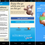
Mobile Welcome UX Antipattern: End User License Agreement (EULA)
Like the overzealous zombie cross-breed between a lawyer and a customs agent, End User License Agreements (EULAs) require multiple forms to be filled out in triplicate, while keeping the customers from enjoying the app they have so laboriously invested time and flash memory space to download.
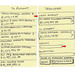
Essential Design Patterns For Mobile Banking
Despite a great deal of mobile innovation, many creators of financial apps still copy their interface patterns from the desktop Web, even though these patterns are not as well suited to the mobile space. Small screens, custom controls, divided attention and fat fingers demand different thinking when designing for mobile: taking what works on the Web and converting it into authentically mobile flows using simple, effective design patterns.
Mobile Magic Moments: Transform the Trivial
When mobile or tablet design is executed well, the device feels like the extension of our bodies. Because interfaces respond even before we consciously give them a command. Often, the interface “dissolves in behavior†and we feel empowered, as though the device we hold in our hand is the equivalent of Iron Man’s suit of cybernetic armor, or Batman’s utility belt. I call this empowering experience a “Magic Momentâ€.

Is Your UI Causing Zero Search Results Pages?
“Designing from Zero” – how to analyze UI challenges that are often the hidden cause of zero-results pages as a catalyst for creating powerful, original design solutions that create customer delight and business revenue.