
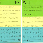
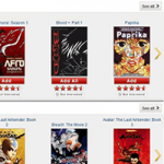
In my workshops, often the greatest challenge for designers is converting their existing Android designs to the new Material Design approach—making the interface both simpler and more visually rich than their corresponding Android 4.x designs, as well as laying out the “happy path†for the customers (using Floating Action Button or FAB, as one of the tools). The following sticky note wireframes demonstrate my quick take on converting the Android 4.x TripAdvisor app into Material Design using $1 Prototype methodology — perfect for prototyping Android Material Designs.

Android, Siri and Tangible Future of Voice Search UX
Today, Apple announced a bunch of enhancements to Siri and voice search. How does Siri UX compare with Android 4.0? What’s just around the corner for Voice Search? Don’t tell your phone or tablet anything else until you’ve read the article.

Digital Cream * June 19, 2012 * San Jose, California
E-Consultancy’s exclusive invitation-only roundtable event, Digital Cream San Jose is an opportunity for senior client-side digital marketers to discuss best practice and the reality of digital marketing with the industry’s ‘cream of the crop’.
The event is designed to help you meet your peers and learn from each other about the latest best practice, what’s working and what’s not.
It’s a ‘hands-on’ participatory event: you will network and learn through discussion, roundtables and debate. Attend FREE as my guest by subscribing to Mobile and Tablet Design Secrets.
Search Engine Summit (SES) * November 14-18, 2011 * Chicago, IL
Panda vs. Human: Advanced eCommerce SEO & UX
This session will introduce cutting-edge human interfaces from Greg Nudelman’s Designing Search: UX Strategies for eCommerce Success – and then consider the same interface from the view of the panda (Google’s new search engine crawler algorithm).
Enterprise Search Summit Fall * November 1-3, 2011 * Washington, DC
Ubiquitous Enterprise Search: New Design Approaches for Mobile and Tablet
Lessons from ecommerce and other consumer-oriented mobile designs will provide practical strategies on managing the high-risk mobile search investment and growing the scope of enterprise search offerings.

Is Your UI Causing Zero Search Results Pages?
“Designing from Zero” – how to analyze UI challenges that are often the hidden cause of zero-results pages as a catalyst for creating powerful, original design solutions that create customer delight and business revenue.

Practical Ecommerce Search: UX Strategies for Success
I wrote the definitive book on the subject: “Designing Search: UX Strategies for eCommerce Successâ€. In this workshop, I help you understand and create a cross-channel digital search strategy and show you how to improve the search experience through practical, intuitive interface design patterns that create 10X or more in ROI.
Immersive Mobile E-Commerce Search Using Drop-Down Menus
Specialized drop-down menu are one of the ways of creating immersive experience in mobile e-commerce search UIs. A novel design pattern, status bar drop-down menu, allows 100% of the screen real estate to be dedicated to search results, while also providing convenient and intuitive access to navigation and filter functions.
Faceted Finding with Super-Powered Breadcrumbs
Introducing Integrated Faceted Breadcrumb (IFB) design that integrates the power of faceted refinement with the intuitive query expansion afforded by browse.
Designing Brand Landing Pages for Mobile Devices
People love to search by brand names. On the small screens of mobile devices, well-designed landing pages can provide a much better experience than keyword search results. This makes brand landing pages today’s biggest sleeper opportunity for mobile and tablet ecommerce. But you have to learn to be completely ruthless with your features and content. Here’s how.
Design4Mobile * September 20-24, 2010 * Chicago, IL
Designing Resourceful Mobile E-Commerce Search
Mobile search presents a compelling story in its own right, with it’s own experience considerations and tremendous opportunities. To help illustrate what creates a resourceful and intuitive mobile search experience, I will present the best material from my upcoming book, Designing Search: UX Strategies for eCommerce Success due out from Wiley in Spring 2011.
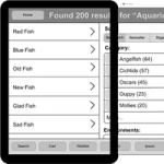
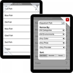
Design Patterns for Mobile Faceted Search: Part II
In Part I of Design Patterns for Mobile Faceted Search, I looked at Four Corners, Modal Overlay, Watermark, and Full-Page Refinement Options design patterns, which maximize the mobile screen real estate. This column covers strategies for making people aware of the filtering options and methods of improving transitions between the various states of a search user interface.
Design Patterns for Mobile Faceted Search: Part I
In my previous Search Matters column, Designing Mobile Search: Turning Limitations into Opportunity, I discussed how mobile search user experiences differ from those on the Web. In this and my next column, I’ll look specifically at the challenges and opportunities of mobile faceted search. This column covers design patterns for maximizing the real estate available for search results, while the next will cover strategies for making people aware of filtering options.
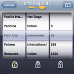
Designing Mobile Search: Turning Limitations into Opportunities
Thinking of porting your Web finding experience to iPhone, Android, or Windows Mobile? Just forget about the fact that these devices are basically full-featured computers with tiny screens. Designing a great mobile search experience requires thinking differently: In terms of turning limitations into opportunities.
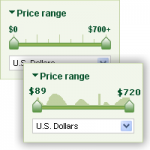
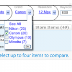
Numeric Filters: Issues and Best Practices
Filters with numeric values remain among the most confusing in faceted search, because many sites have not been able to design usable numeric filters that people can use in an intuitive manner. In this column I cover how to show discrete numeric values, avoid overly constrained filter states, and display key inventory information, and introduce a novel pattern of histogram sliders.
More Like This: A Design Pattern
The idea behind the More Like This pattern is very simple: within each group of items representing a particular category from a catalog or accompanying each item in search results, provide a prominent link or button with a label that is some variation of More Like This ». Unfortunately, most sites do not make sufficient use of this pattern and some that do use it design and implement it incorrectly.
Cameras, Music, and Mattresses: Designing Query Disambiguation Solutions for the Real World
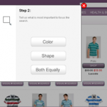
Our language is limited and imperfect. When a customer constructs a query that may have more than one meaning, a good search user interface provides tools to help the customer define the query in less ambiguous terms, so the search results more closely match the person’s intention. This process is known as disambiguation.
Make More Money: Best Practices for Ads in Search Results: Part 2
In Part 2 of Ads Best Practices, we’ll discuss: understanding what makes a good ad, limiting cannibalization, providing ads for internal merchandise instead of third-party advertising, and ads on pages that appear if there are no search results.
Make More Money: Best Practices for Ads in Search Results: Part 1
Conflicting demands make many UX professionals think of ads as a necessary evil. Customers frequently go out of their way to say they hate ads, while marketers always seem to try their hardest to stuff as many of them as they can on each search results page on your site. In this column, I’ve teamed up with advertisement and eyetracking research guru Frank Guo to present real-world strategies for successfully integrating ads into your search results.
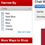
Best Practices for Designing Faceted Search Filters
Office Depot multiple-select attribute-based faceted search redesign misses some key points, making their new search user interface less usable and, therefore, less effective. This makes it an excellent case study for demonstrating best practices for designing filters for faceted search results.
Brave New World of Visual Browsing
Today, everywhere we look, it seems like image content is taking over the Web. The ubiquitous use of digital cameras and improvements in the picture quality of mobile phone cameras has likely helped this phenomenon along. The shift toward content that is primarily visual introduces new challenges and opportunities for developing intuitive and powerful user interfaces for browsing, searching, and filtering visual content.
The Mystery of Filtering by Sorting
For most users of consumer-facing ecommerce applications, the difference between a sort and a filter presents a mystery they understand dimly, if at all. The distinction between sorting and filtering blurs, because of a phenomenon I’ve called filtering by sorting, which leads to all sorts of interesting search user interface implications.
Search Results Satori: Balancing Pogosticking and Page Relevance
When designing the data and layout for search results pages, the challenge is finding the right balance between providing enough information in individual search results, so customers can make informed decisions without pogosticking, and providing enough relevant search results on each page of results to warrant further exploration of the site.
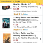
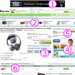
Making $10,000 a Pixel: Optimizing Thumbnail Images in Search Results
In search results, the old adage a picture is worth a thousand words rings true. When it comes to making your search results more efficient to use, more relevant, and more attractive, while dramatically increasing your conversion rates and revenues, images reign supreme. This column discusses how to avoid common pitfalls, and get the most out of your thumbnails.

Searching Help: Don’t Even Go There
Web site user assistance that consistently exceeds customer’s expectations can catapult your company to legendary status and create brand equity you can measure in billions of dollars. However, making Help a strategic asset for your company is an arduous task. To shed light on this important topic, I have teamed up with Tricia Clement, a renowned SUA expert, to deliver actionable insights about Web site user assistance.
Choosing the Right Search Results Page Layout: Make the Most of Your Width
Page layout forms the foundation in presenting search results. Your layout decisions for search results pages will have tremendous impact on the user experience for your entire site. Choosing the right width for search results is important, and the optimal width for search results may be a great deal narrower than some people using big monitors would believe.
Starting from Zero: Winning Strategies for No Search Results Pages
Search, more than any other activity on your Web site, is a living, evolving process of discovery, a conversation between a customer and your system. Unfortunately, misunderstandings in this conversation are all too common, and the effectiveness of the zero search results page is critical to keeping the customer engaged. Moreover, thinking creatively about the zero results case can turn a temporary snag in communication into an opportunity for deeper connection and a source of tremendous competitive advantage.
Improve the Usability of Search-Results Pages: Add Sophisticated but Easy-to-Use Filtering and Sorting Controls
Originally Published in JavaWorld.com, January 23, 2006 ⇒ E.R. Tufte, in his phenomenal book Envisioning Information, states, “Clarity and simplicity are completely opposite of simple-mindedness.” This false simple-mindedness is often evident in the design of a search-results page. Even on some of the leading e-commerce sites, this important page is frequently made hard to use …
Timestamp-Based Caching Framework: Current Data with Peak Performance
Originally Published on JavaWorld.com, January 3, 2005 ⇒ Build a dynamic LRU cache framework using standard Java utility classes In his timeless masterpiece, The Art of War, Sun Tzu states: “…one who is skilled in warfare principles …takes the enemy’s walled city without attacking… His aim must be to take All-Under-Heaven intact. Therefore, weapons will …